In the late 1940s, the Herman Miller Company was at the forefront of modern furniture production, creating a host of objects that have since become iconic symbols of American Modernism. Behind much of the company’s success over the next twenty-five years was George Nelson, an architect who would go on to become a pioneering figure in the fields of furniture and interior design, not to mention corporate identity. Yet, it is his visionary thinking and talents as a writer that may outlast even his finest designs. Ettore Sottsass, who spent a brief stint in Nelson’s office, remarked, “He wanted to design for an American society to come, a society that could have become the new society, invaded by prosperity, by the certainties of technology, invade by optimism—a relaxed society, a society capable of playing, a society capable of humour, and above all a society without fear.”1
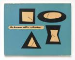
Hired in 1946 by the founder of Herman Miller, D. J. De Pree, Nelson came without any experience as an industrial designer but brought a fresh and strategic perspective to his work as design director. He wasted little time in creating a furniture collection that yielded an astounding seventy-seven pieces, while simultaneously recruiting some of the finest designers of the period, including Charles Eames and Isamu Noguchi. When it came time to market the collection in 1948, Nelson understood that design innovation required an equally progressive promotional campaign, which became a hallmark of Herman Miller.2 Accordingly, his team of designers mocked up a substantive seventy-two-page sales catalogue with dimensional drawings and lush photos by Ezra Stoller, the preeminent architectural photographer of the day. When De Pree balked at the $30,000 cost needed to produce the ten-thousand-volume print run for the catalogue, Nelson doubled down with the same layout and design. However, this time he had it bound as a hardcover with an elegant dust jacket by Irving Harper and a $3 price tag affixed to the inner front flap. Charging for a sales catalogue was unheard of in the commercial furniture business at the time. That said, Nelson’s gambit helped to resolve the immediate financial issue, while also signaling to the market that quality furniture comes at an equivalent price.3 To his credit, De Pree relented and approved the venture. The catalogue was an immediate success and had to be reprinted; it also set a new standard that others like Knoll were soon to follow.4 De Pree later expressed, “The cheek of the thing was so staggering!”5
In his prefatory remarks for a 1951 publication Books for Our Time, Nelson commented, “For the contemporary industrial designer or architect the book is an object whose design has lagged, in some unaccountable manner, behind most of the physical apparatus currently in use.”6 Not to mention, furniture catalogues were traditionally musty, modest affairs that lacked sophistication and suffered from poor writing. Nelson clearly had other ideas and, unlike many of his design counterparts, was equally adept as a writer as he was at a drafting table. He also grasped that new design, like new ideas, required a certain degree of audience cultivation.7 As he put it, good design “reaches its full potential when it is experienced by a person fully equipped to understand and enjoy what it has to communicate.”8 Consequently, the catalogue had the burden of serving multiple roles to varying audiences—first and foremost as a buyer’s guide and general marketing tool for the company, while also acting as an educational tool for the public, a slowly developing sales force, and, as stated on the dust jacket, “as a reference work for architects, designers, decorators and students.”9
In the preface to the catalogue, Nelson outlined the Herman Miller philosophy through five points: what you make is important; design is an integral part of the business; the product must be honest; you decide what you will make; and there is a market for good design. His clearly articulated message reflected not only the attitudes and ideals central to Herman Miller but also revealed many of the values attributed to midcentury design that still ring true today.
By the mid-1950s, the market for modern furniture was fairly well established and becoming increasingly competitive, resulting in a shift at Herman Miller. De Pree began openly questioning the company’s cultivation of an elitist, luxury brand.10 As a result, the scale and ambition of their catalogues echoed these concerns, including Herman Miller’s Blueprint for Modern Living of 1957. This brochure featured many of the hallmarks of the first catalogue, with yet another evocative Irving Harper cover design, a reflective text by Nelson, and a layout that highlighted Stoller’s photos alongside instructive texts. Gone are the dimensional drawings, product details, and extensive designer biographies. Most notably, the trim size was sufficiently smaller and the page count had dropped to a modest twenty pages, resulting in a stapled binding. Nelson’s text drives home the point that “modern furniture has been accepted in the post-war years is something of a phenomenon.” He outlines the causes of this shift as twofold: the modern home is simply smaller than in previous generations, and the world has become increasingly complex. He then explains how the designers at Herman Miller go beyond functional requirements “to bring furniture up to the design level of the best modern architecture.” In doing so, he recognizes that the designer is not simply “an organizer of space” but an artist charged with creating objects that are infused with simplicity, beauty, and meaning.11
Another designer brought into the Herman Miller fold by Nelson was Alexander Girard, who was hired to head the company’s new textiles division in 1952. Much like the state of furniture design at midcentury, textile design in America was caught in a time warp replete with eighteenth- and nineteenth-century motifs. Girard helped to revitalize American textile design through his absorption and synthesis of folk art traditions found in Mexico, India, and beyond.12 Trained as an architect, he also employed his talents as a furniture designer at Herman Miller, creating a collection that was branded as the Girard Group in 1967. A large-scale poster that doubled as a promotional brochure served as a marketing tool for the collection, complete with dimensions, specifications, and fabric choices. Color photographs feature tables, chairs, couches, and ottomans that underscore the varied selection of interchangeable components for the collection. Most notably, the poster presents a seemingly inexhaustible number of upholstery finishes, showcasing the bold patterns and high-key colors typical of Girard’s aesthetic. Girard recognized the changing needs of consumers who were seeking warmer and more inviting office spaces while also welcoming more efficient and less cluttered home environs. As he put it, “My Group of furniture designs resemble the chameleon: Its character remains intact yet its skin texture and color change to suit the environment.”13
In 1957 twenty-six of George Nelson’s articles from the previous decade were anthologized in a volume titled Problems of Design.14 These were culled from many of the most widely respected publications of the day, including Interiors, Architectural Forum, and Industrial Design. While the subject of design is central to the anthology, Nelson’s expansive knowledge and interests are on full display, with essays devoted to architecture, art, town planning, and interiors. His attention extended to topics as diverse as the decay of cities, the determination of taste, and the demand for second homes. The volume concludes with the cheeky yet fresh and insightful text “Notes on the New Subscape,” which explores the hidden understory of furniture. Nelson muses, “The subscape unfolds its manifold wonders in a zone of nearly total invisibility, and it has been good traditional practice to keep it so. The best furniture builders have hidden legs wherever possible and treated them with inconspicuous decency when it was not.”15 The essay exemplifies Nelson’s unrestrained curiosity, sense of wit, and philosophical mindset. His writing distinguished him from many of his contemporaries, as “he was able to convey his contemplations to others in felicitous writing that, at its best, had the relaxed naturalness of conversation.”16 Ultimately, Nelson will no doubt be remembered as among the most pioneering and inventive of modern designers, as well as the voice of a generation.
—Jon Evans
Notes
1. Stanley Abercrombie, George Nelson: The Design of Modern Design (Cambridge, MA: MIT Press, 1995), ix.
2. Ralph Caplan, The Design of Herman Miller (New York: Whitney Library of Design, 1976),
28.
3. Kristina Wilson, Mid-Century Modernism and the American Body: Race, Gender, and the Politics of Power in Design (Princeton, NJ: Princeton University Press, 2021), 120.
4. Herman Miller, Inc., “The Story of Herman Miller’s 1948 Catalog,” 1:05 to 2:40, https://www.youtube.com/watch?v=YjluW4S-umM (accessed December 4, 2023).
5. Abercrombie, George Nelson, 99.
6. Marshall Lee, ed., Books for Our Time (New York: Oxford University Press, 1951), 9.
7. See Kathryn B. Hiesinger, ed., et al., Design Since 1945 (Philadelphia: Philadelphia Museum of Art, 1983), 8; Caplan, The Design of Herman Miller, 29.
8. Alex Coles, ed., Design and Art (London: Whitechapel, 2007), 22.
9. Ralph Caplan and George Nelson, The Herman Miller Collection, 1952: Furniture Designed by George Nelson and Charles Eames, with Occasional Pieces by Isamu Noguchi, Peter Hvidt, and O. M. Nielsen (New York: Acanthus Press, 1995), vii.
10. Wilson, Mid-Century Modernism and the American Body, 121.
11. George Nelson, Blueprint for Modern Living (Zeeland, MI: Herman Miller Furniture Company, 1957), 3–4.
12. Leslie Piña, Alexander Girard Designs for Herman Miller (Atglen, PA: Schiffer Publishing, 1998), 6.13. Alexander Girard, The Girard Group poster (Zeeland, MI: Herman Miller, 1967), front and back.
14 George Nelson, Problems of Design (New York: Whitney Publications, 1957).
15 Ibid., 194.
16 Alexander von Vegesack, George Nelson: Architect, Writer, Designer, Teacher (Weil am Rhein, Germany: Vitra Design Stiftung, 2008), 20.


